
Control Templates allow the look and feel of Controls in Silverlight allowing for a flexible user experience.
Here is the Hello World example using a Control Template and the Visual State Manager to Customise the Button.
Printer Friendly Download Tutorial (214KB) Download Source Code (6.67KB) Online Demonstration
Step 1
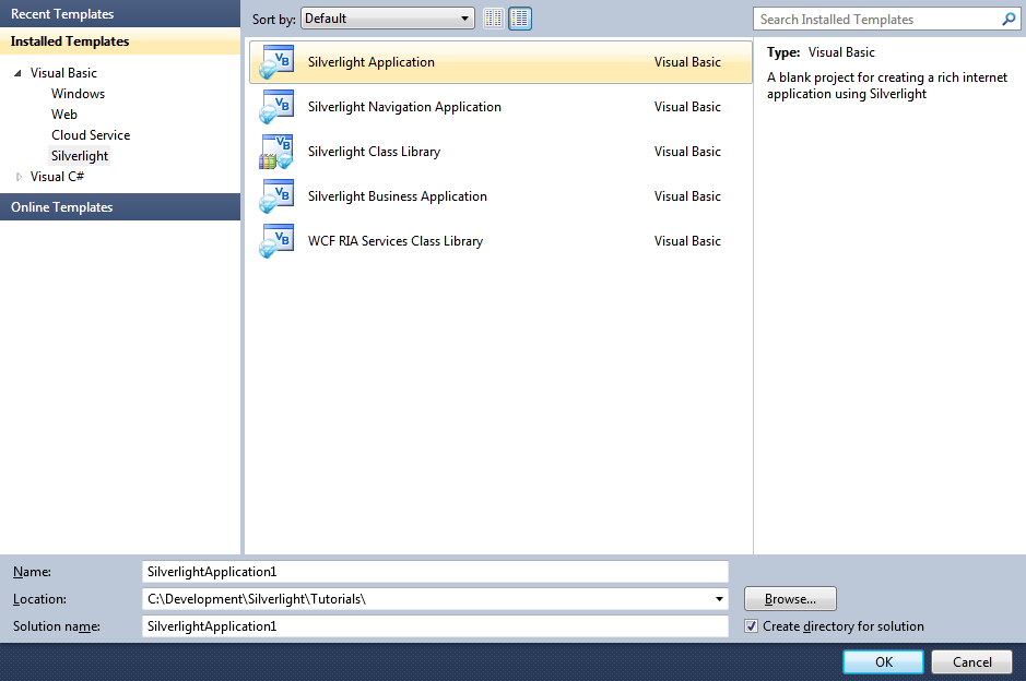
Start Microsoft Visual Web Developer 2010 Express, then Select File then New Project... Select "Visual Basic" then "Silverlight Application" from Templates, select a Location if you wish, then enter a name for the Project and then click OK, see below:
Step 2
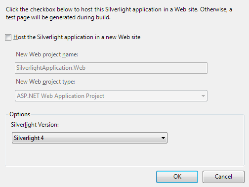
New Silverlight Application window should appear, uncheck the box "Host the Silverlight Application in a new Web site" and then select the required Silverlight Version, see below:
Step 3
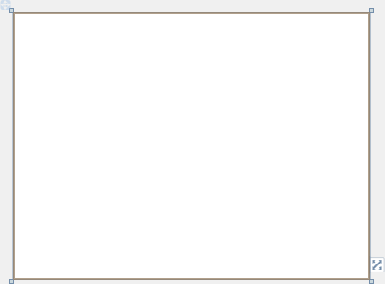
A Blank Page named MainPage.xaml should then appear, see below:
Step 4
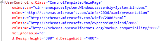
In the XAML Pane for the MainPage.xaml, below the "x:Class="ControlTemplate.MainPage" section, type the following XAML:
xmlns:vsm="clr-namespace:System.Windows;assembly=System.Windows"
See below:
Step 5
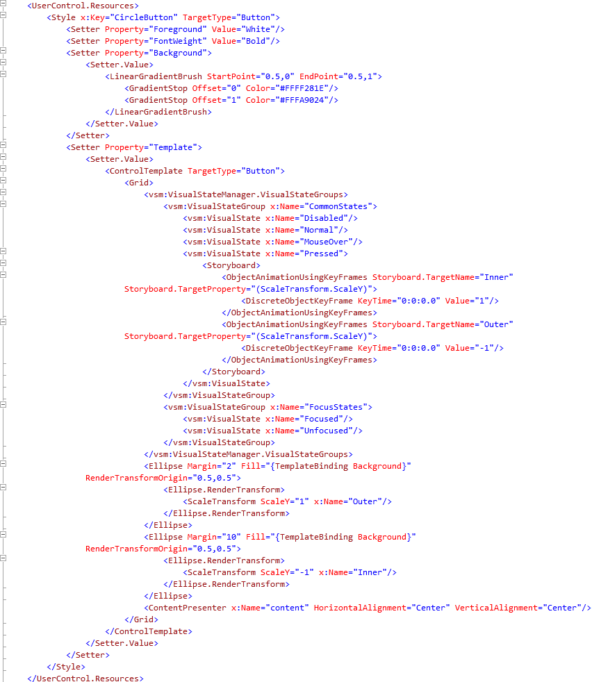
While still the XAML Pane for the MainPage.xaml, above the "<Grid>" and below the top "<UserControl>" tag, type the following XAML:
<UserControl.Resources>
  <Style x:Key="CircleButton" TargetType="Button">
    <Setter Property="Foreground" Value="White"/>
    <Setter Property="FontWeight" Value="Bold"/>
    <Setter Property="Background">
      <Setter.Value>
        <LinearGradientBrush StartPoint="0.5,0" EndPoint="0.5,1">
          <GradientStop Offset="0" Color="#FFFF281E"/>
          <GradientStop Offset="1" Color="#FFFA9024"/>
        </LinearGradientBrush>
      </Setter.Value>
    </Setter>
    <Setter Property="Template">
      <Setter.Value>
        <ControlTemplate TargetType="Button">
          <Grid>
            <vsm:VisualStateManager.VisualStateGroups>
              <vsm:VisualStateGroup x:Name="CommonStates">
                <vsm:VisualState x:Name="Disabled"/>
                <vsm:VisualState x:Name="Normal"/>
                <vsm:VisualState x:Name="MouseOver"/>
                <vsm:VisualState x:Name="Pressed">
                  <Storyboard>
                    <ObjectAnimationUsingKeyFrames Storyboard.TargetName="Inner"
                        Storyboard.TargetProperty="(ScaleTransform.ScaleY)">
                      <DiscreteObjectKeyFrame KeyTime="0:0:0.0" Value="1"/>
                    </ObjectAnimationUsingKeyFrames>
                    <ObjectAnimationUsingKeyFrames Storyboard.TargetName="Outer"
                        Storyboard.TargetProperty="(ScaleTransform.ScaleY)">
                      <DiscreteObjectKeyFrame KeyTime="0:0:0.0" Value="-1"/>
                    </ObjectAnimationUsingKeyFrames>
                  </Storyboard>
                </vsm:VisualState>
              </vsm:VisualStateGroup>
              <vsm:VisualStateGroup x:Name="FocusStates">
                <vsm:VisualState x:Name="Focused"/>
                <vsm:VisualState x:Name="Unfocused"/>
              </vsm:VisualStateGroup>
            </vsm:VisualStateManager.VisualStateGroups>
            <Ellipse Margin="2" Fill="{TemplateBinding Background}"
                RenderTransformOrigin="0.5,0.5">
              <Ellipse.RenderTransform>
                <ScaleTransform ScaleY="1" x:Name="Outer"/>
              </Ellipse.RenderTransform>
            </Ellipse>
            <Ellipse Margin="10" Fill="{TemplateBinding Background}"
                RenderTransformOrigin="0.5,0.5">
              <Ellipse.RenderTransform>
                <ScaleTransform ScaleY="-1" x:Name="Inner"/>
              </Ellipse.RenderTransform>
            </Ellipse>
            <ContentPresenter x:Name="content" HorizontalAlignment="Center" VerticalAlignment="Center"/>
          </Grid>
        </ControlTemplate>
      </Setter.Value>
    </Setter>
  </Style>
</UserControl.Resources>
See below:
Step 6
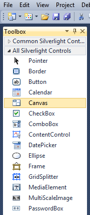
Return to the MainPage Designer View by selecting the "MainPage.xaml" Tab.
Then from the All Silverlight Controls section in the Toolbox select the Canvas control:
Step 7
Draw a Canvas that fill the whole Page or in the XAML Pane between the "<Grid>" and "</Grid>" lines type the following XAML:
<Canvas Height="300" Width="400" HorizontalAlignment="Left" VerticalAlignment="Top" Name="Page">
</Canvas>
See below:
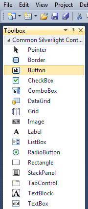
Step 8
Then from the Common Silverlight Controls section in the Toolbox select the Button control:
Step 9
Draw a Button on the Page by dragging a Button from the Toolbox onto the Canvas then in the XAML Pane inbetween the "<Canvas>" and "</Canvas>" tags change the "<Button>" line to the following:
<Button Canvas.Left="125" Canvas.Top="75" Height="150" Width="150" Style="{StaticResource CircleButton}" Content="Click Here" Name="HelloWorld"/>
See below:
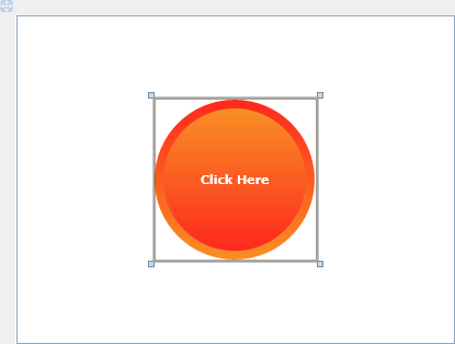
Step 10
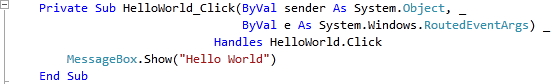
The Button should have the "CircleButton" Style applied to it.
Then Double Click on the Button Control and type in the HelloWorld_Click Sub:
MessageBox.Show("Hello World")
See Below:
Step 11
Save the Project as you have now finished the Silverlight application. Select Debug then Start Debugging or click on Start Debugging:
After you do, the following will appear in a new Web Browser window:

Step 12
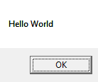
Now click where it says "Click Here" and a Message Box will appear with the following contents:
Step 13
Close the Application and Browser window by clicking on the Close Button  on
the top right of the Application Window and Web Browser to Stop the application.
on
the top right of the Application Window and Web Browser to Stop the application.
That was a simple example of Customising the Control Template of a Control such as a Button, it is possible to change the look-and-feel of other controls or add more behavours - there are other states such as MouseOver, Focused and Disabled, see what you can make your control do!
