
Doodle Pad uses the InkPresenter feature of Silverlight featuring Draw Width and Colour, plus Open and Save support.
Printer Friendly Download Tutorial (365KB) Download Source Code (7.54KB) Online Demonstration
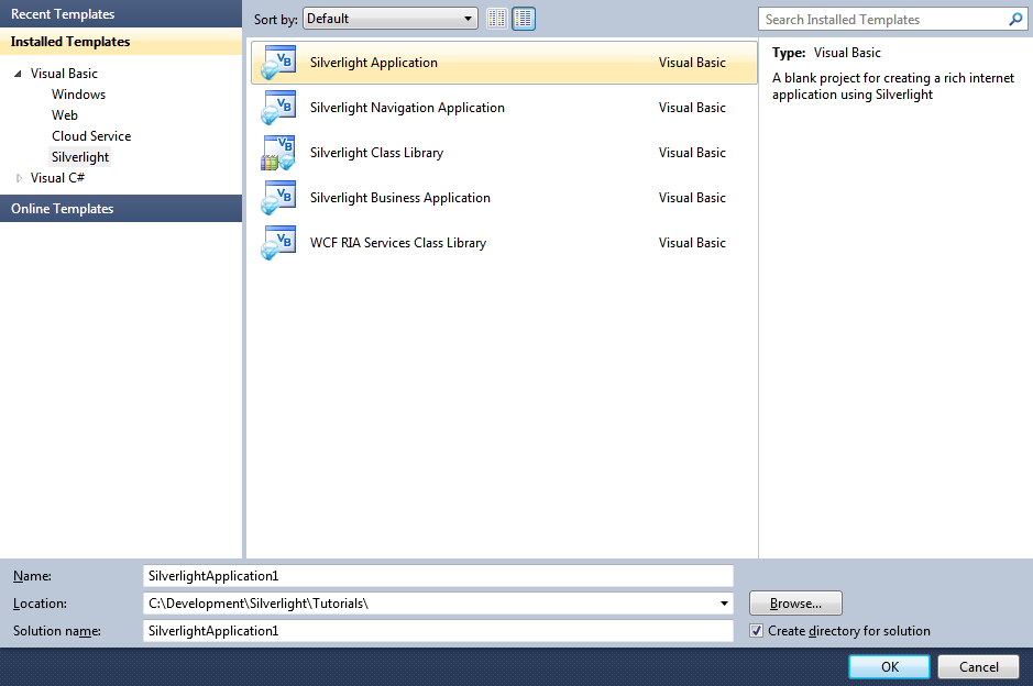
Step 1
Start Microsoft Visual Web Developer 2010 Express, then Select File then New Project... Select "Visual Basic" then "Silverlight Application" from Templates, select a Location if you wish, then enter a name for the Project and then click OK, see below:
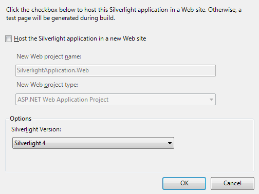
Step 2
New Silverlight Application window should appear, uncheck the box "Host the Silverlight Application in a new Web site" and then select the required Silverlight Version, see below:
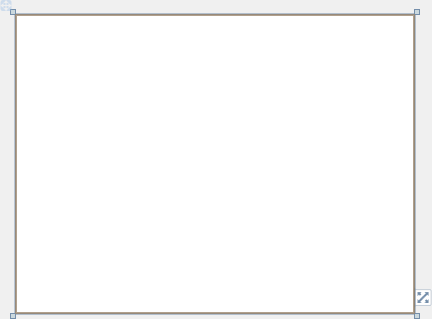
Step 3
A Blank Page named MainPage.xaml should then appear, see below:
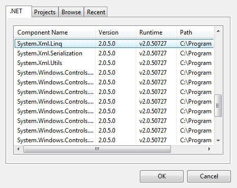
Step 4
Select Project then Add Reference... The "Add Reference" window should appear, select "System.XML.Linq" from the ".NET" List, see below:
Step 5
Add the Reference to "System.XML.Linq" by Clicking on OK
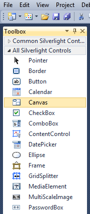
Then from the All Silverlight Controls section in the Toolbox select the Canvas control:
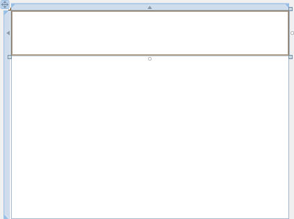
Step 6
Draw a Canvas on the Page then in the XAML Pane above the "</Grid>" then change the "Canvas1" line to the following:
<Canvas Height="65" Width="400" VerticalAlignment="Top" HorizontalAlignment="Left" Name="Toolbar"></Canvas>
See below:
Step 7
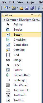
Then from the Common Silverlight Controls section in the Toolbox select the Button control:
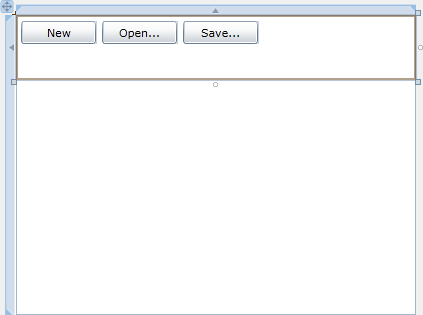
Step 8
Draw Three Buttons on the "Toolbar" Canvas by dragging the Buttons from the Toolbox onto the Canvas then in the XAML Pane inbetween the "<Canvas>" and "</Canvas>" tags change the "<Button>" lines to the following:
<Button Canvas.Left="6" Canvas.Top="6" Height="23" Width="75" Name="New" Content="New"/>
<Button Canvas.Left="87" Canvas.Top="6" Height="23" Width="75" Name="Open" Content="Open..."/>
<Button Canvas.Left="168" Canvas.Top="6" Height="23" Width="75" Name="Save" Content="Save..."/>
See below:
Step 9
While still in the XAML Pane, below the last "<Button>" tag and above the "</Canvas>" type the following ComboBox XAML:
<ComboBox Canvas.Left="6" Canvas.Top="35" Height="23" Width="156" Name="Size">
  <ComboBoxItem Tag="1">
    <Rectangle Height="1" Width="150" Fill="Black"/>
  </ComboBoxItem>
  <ComboBoxItem Tag="2">
    <Rectangle Height="2" Width="150" Fill="Black"/>
  </ComboBoxItem>
  <ComboBoxItem Tag="5" IsSelected="True">
    <Rectangle Height="5" Width="150" Fill="Black"/>
  </ComboBoxItem>
  <ComboBoxItem Tag="10">
    <Rectangle Height="10" Width="150" Fill="Black"/>
  </ComboBoxItem>
  <ComboBoxItem Tag="15">
    <Rectangle Height="15" Width="150" Fill="Black"/>
  </ComboBoxItem>
  <ComboBoxItem Tag="20">
    <Rectangle Height="20" Width="150" Fill="Black"/>
  </ComboBoxItem>
  <ComboBoxItem Tag="25">
    <Rectangle Height="25" Width="150" Fill="Black"/>
  </ComboBoxItem>
  <ComboBoxItem Tag="30">
    <Rectangle Height="30" Width="150" Fill="Black"/>
  </ComboBoxItem>
  <ComboBoxItem Tag="40">
    <Rectangle Height="40" Width="150" Fill="Black"/>
  </ComboBoxItem>
  <ComboBoxItem Tag="50">
    <Rectangle Height="50" Width="150" Fill="Black"/>
  </ComboBoxItem>
</ComboBox>

<ComboBox Canvas.Left="168" Canvas.Top="35" Height="23" Width="75" Name="Colour">
  <ComboBoxItem Tag="FF000000" IsSelected="True">
    <Rectangle Width="25" Height="14" Fill="Black"/>
  </ComboBoxItem>
  <ComboBoxItem Tag="FF808080">
    <Rectangle Width="25" Height="14" Fill="Gray"/>
  </ComboBoxItem>
  <ComboBoxItem Tag="FFFF0000">
    <Rectangle Width="25" Height="14" Fill="Red"/>
  </ComboBoxItem>
  <ComboBoxItem Tag="FFFFA500">
    <Rectangle Width="25" Height="14" Fill="Orange"/>
  </ComboBoxItem>
  <ComboBoxItem Tag="FFFFFF00">
    <Rectangle Width="25" Height="14" Fill="Yellow"/>
  </ComboBoxItem>
  <ComboBoxItem Tag="FF008000">
    <Rectangle Width="25" Height="14" Fill="Green"/>
  </ComboBoxItem>
  <ComboBoxItem Tag="FF00FFFF">
    <Rectangle Width="25" Height="14" Fill="Cyan"/>
  </ComboBoxItem>
  <ComboBoxItem Tag="FF0000FF">
    <Rectangle Width="25" Height="14" Fill="Blue"/>
  </ComboBoxItem>
  <ComboBoxItem Tag="FFFF00FF">
    <Rectangle Width="25" Height="14" Fill="Magenta"/>
  </ComboBoxItem>
  <ComboBoxItem Tag="FF800080">
    <Rectangle Width="25" Height="14" Fill="Purple"/>
  </ComboBoxItem>
</ComboBox>
See below:
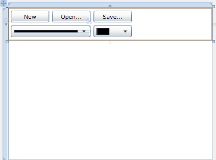
Step 10
Again while still in the XAML Pane below the "</Canvas>" and above the "</Grid>" Tag, type the following InkPresenter XAML:
<InkPresenter Height="236" Width="400" Margin="0,64,0,0" HorizontalAlignment="Left" VerticalAlignment="Top"
Background="White" Name="Surface"/>
See below:
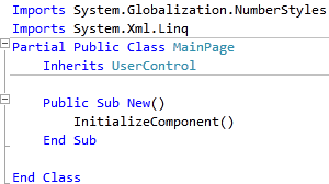
Step 11
Right Click on the Page or the entry for "MainPage.xaml" in Solution Explorer and choose the "View Code" option. In the Code View above the "Partial Public Class MainPage" line type the following:
Imports System.Globalization.NumberStyles
Imports System.Xml.Linq
See Below:
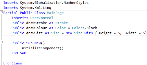
Step 12
While still in the Code View for MainPage.xaml, below the "Inherits UserControl" line type the following:
Public drawStroke As Stroke
Public drawColour As Color = Colors.Black
Public drawSize As Size = New Size With {.Height = 5, .Width = 5}
See Below:
Step 13
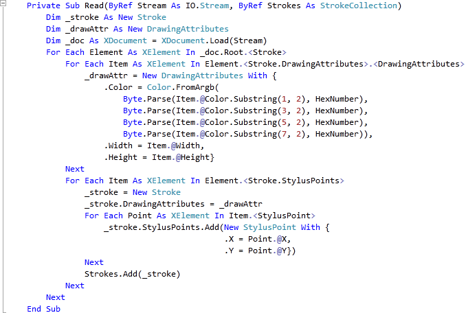
While still in the Code View for MainPage.xaml, below the "End Sub" for "Public Sub New()" Constructor type the following Sub:
Private Sub Read(ByRef Stream As IO.Stream, ByRef Strokes As StrokeCollection)
  Dim _stroke As New Stroke
  Dim _drawAttr As New DrawingAttributes
  Dim _doc As XDocument = XDocument.Load(Stream)
  For Each Element As XElement In _doc.Root.<Stroke>
    For Each Item As XElement In Element.<Stroke.DrawingAttributes>.<DrawingAttributes>
      _drawAttr = New DrawingAttributes With {
      .Color = Color.FromArgb(
        Byte.Parse(Item.@Color.Substring(1, 2), HexNumber),
        Byte.Parse(Item.@Color.Substring(3, 2), HexNumber),
        Byte.Parse(Item.@Color.Substring(5, 2), HexNumber),
        Byte.Parse(Item.@Color.Substring(7, 2), HexNumber)),
      .Width = Item.@Width,
      .Height = Item.@Height}
    Next
    For Each Item As XElement In Element.<Stroke.StylusPoints>
      _stroke = New Stroke
      _stroke.DrawingAttributes = _drawAttr
      For Each Point As XElement In Item.<StylusPoint>
        _stroke.StylusPoints.Add(New StylusPoint With {
          .X = Point.@X,
          .Y = Point.@Y})
      Next
      Strokes.Add(_stroke)
    Next
  Next
End Sub
See Below:
Step 14
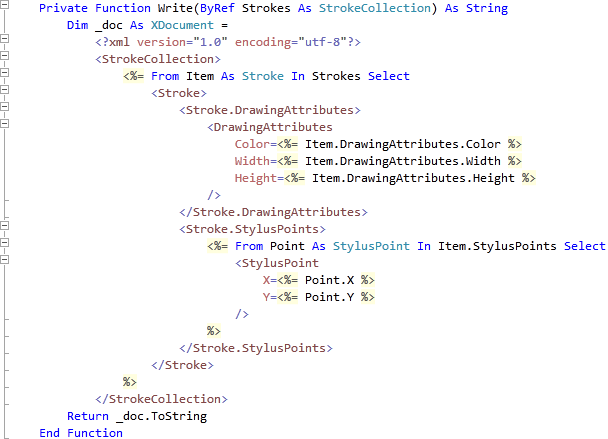
While still in the Code View for MainPage.xaml, below the "End Sub" for "Private Sub Read(...)" type the following Function:
Private Function Write(ByRef Strokes As StrokeCollection) As String
  Dim _doc As XDocument =
    <?xml version="1.0" encoding="utf-8"?>
    <StrokeCollection>
      <%= From Item As Stroke In Strokes Select
        <Stroke>
          <Stroke.DrawingAttributes>
            <DrawingAttributes
              Color=<%= Item.DrawingAttributes.Color %>
              Width=<%= Item.DrawingAttributes.Width %>
              Height=<%= Item.DrawingAttributes.Height %>
            />
          </Stroke.DrawingAttributes>
          <Stroke.StylusPoints>
            <%= From Point As StylusPoint In Item.StylusPoints Select
              <StylusPoint
              X=<%= Point.X %>
              Y=<%= Point.Y %>
              />
            %>
          </Stroke.StylusPoints>
        </Stroke>
      %>
    </StrokeCollection>
  Return _doc.ToString
End Function
See Below:
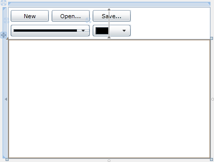
Step 15
Return to the Designer View by selecting the "MainPage.xaml" Tab, or Right Click on the Page or the Entry for "MainPage.xaml" in Solution Explorer and choose the "View Designer" option.
Click on the "Surface" InkPresenter, then goto the Properties box and Click on the "Events" Tab, see below:
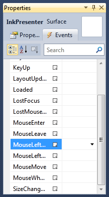
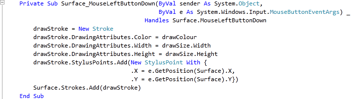
Double Click on the "MouseLeftButtonDown" Event and type in the Surface_MouseLeftButtonDown Sub:
drawStroke = New Stroke
drawStroke.DrawingAttributes.Color = drawColour
drawStroke.DrawingAttributes.Width = drawSize.Width
drawStroke.DrawingAttributes.Height = drawSize.Height
drawStroke.StylusPoints.Add(New StylusPoint With {
  .X = e.GetPosition(Surface).X,
  .Y = e.GetPosition(Surface).Y})
Surface.Strokes.Add(drawStroke)
See Below:
Step 16
Return to the Designer View by selecting the "MainPage.xaml" Tab, or Right Click on the Page or the Entry for "MainPage.xaml" in Solution Explorer and choose the "View Designer" option.
Click on the "Surface" InkPresenter, then goto the Properties box and Click on the "Events" Tab, see below:
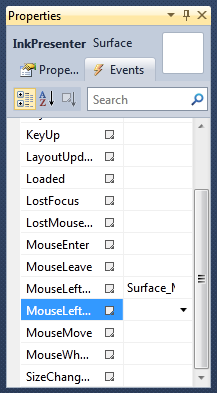
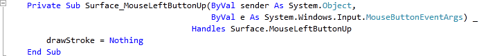
Double Click on the "MouseLeftButtonUp" Event and type in the Surface_MouseLeftButtonUp Sub:
drawStroke = Nothing
See Below:
Step 17
Return to the Designer View by selecting the "MainPage.xaml" Tab, or Right Click on the Page or the Entry for "MainPage.xaml" in Solution Explorer and choose the "View Designer" option.
Click on the "Surface" InkPresenter, then goto the Properties box and Click on the "Events" Tab, see below:
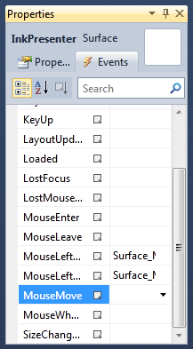
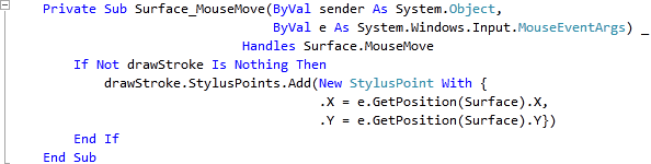
Double Click on the "MouseMove" Event and type in the Surface_MouseMove Sub:
If Not drawStroke Is Nothing Then
  drawStroke.StylusPoints.Add(New StylusPoint With {
    .X = e.GetPosition(Surface).X,
    .Y = e.GetPosition(Surface).Y})
End If
See Below:
Step 18
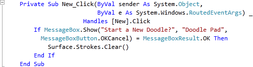
Return to the Designer View by selecting the "MainPage.xaml" Tab, or Right Click on the Page or the Entry for "MainPage.xaml" in Solution Explorer and choose the "View Designer" option.
Double Click on the "New" Button and type in the New_Click Sub:
If MessageBox.Show("Start a New Doodle?", "Doodle Pad",
    MessageBoxButton.OKCancel) = MessageBoxResult.OK Then
  Surface.Strokes.Clear()
End If
See Below:
Step 19
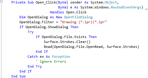
Return to the Designer View by selecting the "MainPage.xaml" Tab, or Right Click on the Page or the Entry for "MainPage.xaml" in Solution Explorer and choose the "View Designer" option.
Double Click on the "Open..." Button and type in the Open_Click Sub:
Dim OpenDialog As New OpenFileDialog
OpenDialog.Filter = "Drawing (*.ipr)|*.ipr"
If OpenDialog.ShowDialog Then
  Try
    If OpenDialog.File.Exists Then
      Surface.Strokes.Clear()
      Read(OpenDialog.File.OpenRead, Surface.Strokes)
    End If
  Catch ex As Exception
    ' Ignore Errors
  End Try
End If
See Below:
Step 20
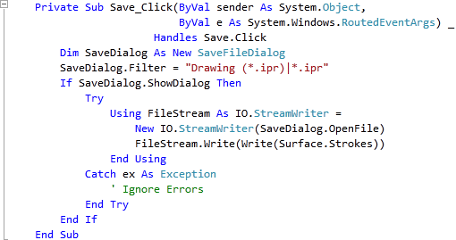
Return to the Designer View by selecting the "MainPage.xaml" Tab, or Right Click on the Page or the Entry for "MainPage.xaml" in Solution Explorer and choose the "View Designer" option.
Double Click on the "Save..." Button Control and type in the Save_Click Sub:
Dim SaveDialog As New SaveFileDialog
SaveDialog.Filter = "Drawing (*.ipr)|*.ipr"
If SaveDialog.ShowDialog Then
  Try
    Using FileStream As IO.StreamWriter =
        New IO.StreamWriter(SaveDialog.OpenFile)
      FileStream.Write(Write(Surface.Strokes))
    End Using
  Catch ex As Exception
    ' Ignore Errors
  End Try
End If
See Below:
Step 21
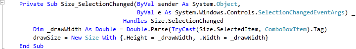
Return to the Designer View, by selecting the "MainPage.xaml" Tab, or Right Click on the Page or the Entry for "MainPage.xaml" in Solution Explorer and choose the "View Designer" option.
Double Click on the Large ComboBox (Size) and type in the Size_SelectionChanged Sub:
Dim _drawWidth As Double = Double.Parse(TryCast(Size.SelectedItem, ComboBoxItem).Tag)
drawSize = New Size With {.Height = _drawWidth, .Width = _drawWidth}
See Below:
Step 22
Return to the Designer View, by selecting the "MainPage.xaml" Tab, or Right Click on the Page or the Entry for "MainPage.xaml" in Solution Explorer and choose the "View Designer" option.
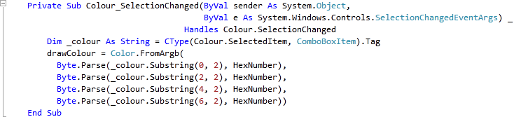
Double Click on the Smaller ComboBox (Colour) and type in the Colour_SelectionChanged Sub:
Dim _colour As String = CType(Colour.SelectedItem, ComboBoxItem).Tag
drawColour = Color.FromArgb(
  Byte.Parse(_colour.Substring(0, 2), HexNumber),
  Byte.Parse(_colour.Substring(2, 2), HexNumber),
  Byte.Parse(_colour.Substring(4, 2), HexNumber),
  Byte.Parse(_colour.Substring(6, 2), HexNumber)))
See Below:
Step 23
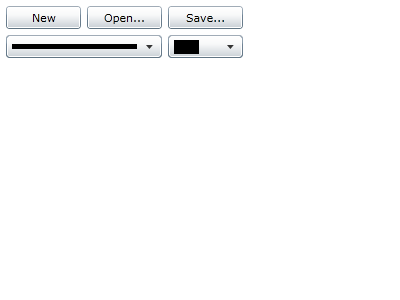
Save the Project as you have now finished the Silverlight application. Select Debug then Start Debugging or click on Start Debugging:
After you do, the following will appear in a new Web Browser window:
Step 24
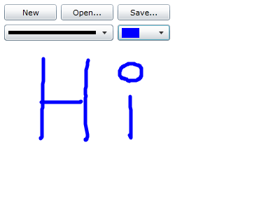
Click on the "Colour" ComboBox to change the Draw Colour, the Draw Width can be changed with the first ComboBox, then click the Left Mouse Button and move the Mouse to Draw, which then can be Saved, see below:
Step 25
Close the Application and Browser window by clicking on the Close Button  on
the top right of the Application Window and Web Browser to Stop the application.
on
the top right of the Application Window and Web Browser to Stop the application.
This was a simple Doodle Pad example, using the InkPresenter and LINQ to Save the "strokes" used to draw with - Saved into XML, which can then be Opened later. Try adding more features such as more Draw Sizes and Colours - make it your own!
