Image Carousel is a Carousel that allows images to be displayed as it revolves around, in this case it is a Horizontal Carousel.
Printer Friendly Download Tutorial (639KB) Download Source Code (8.37KB) Online Demonstration
Step 1
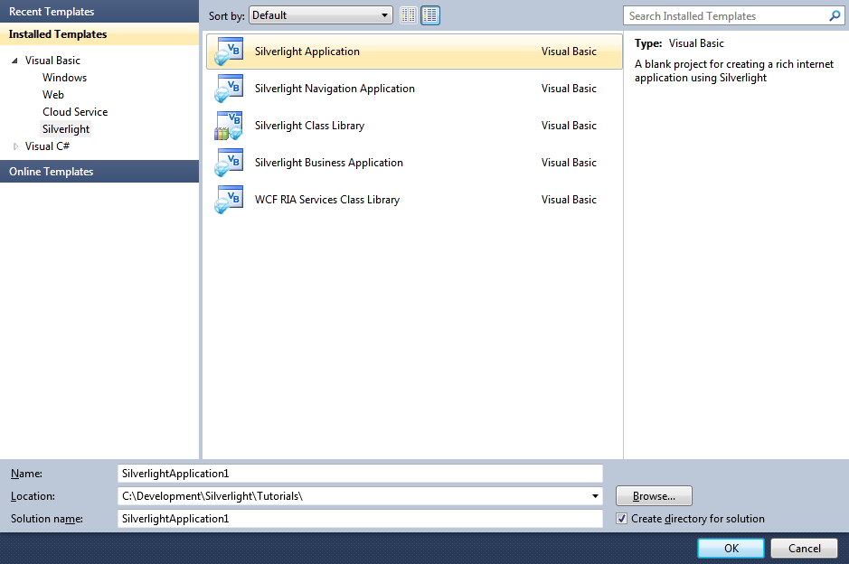
Start Microsoft Visual Web Developer 2010 Express, then Select File then New Project... Select "Visual Basic" then "Silverlight Application" from Templates, select a Location if you wish, then enter a name for the Project and then click OK, see below:
Step 2
New Silverlight Application window should appear, uncheck the box "Host the Silverlight Application in a new Web site" and then select the required Silverlight Version, see below:

Step 3
A Blank Page named MainPage.xaml should then appear, see below:

Step 4
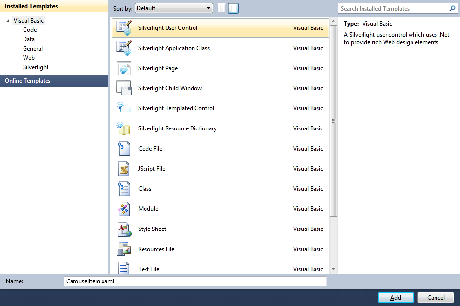
Select Project then "Add New Item...", and select the "Silverlight User Control" Template if not already Selected, then change the "Name" to CarouselItem.xaml, see below:
Step 5
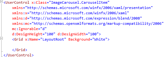
Add the new User Control to the Project by Clicking on Add, then in the XAML Pane for the CarouselItem.xaml User Control,
for the "<UserControl>" Tag change the DesignHeight and DesignWidth Attributes to "100", see below:
Step 6
While still in the XAML Pane for CarouselItem.xaml below the "<Grid>" and above the "</Grid>" Tag, type the following Image Control XAML:
<Image Height="100" Width="100" Name="Image">
  <Image.RenderTransform>
    <TransformGroup>
      <ScaleTransform ScaleX="1" ScaleY="1" x:Name="ItemScale"/>
    </TransformGroup>
  </Image.RenderTransform>
</Image>
See below:
Step 7
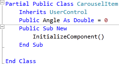
Right Click on the Page or the entry for "CarouselItem.xaml" in Solution Explorer and choose the "View Code" option. In the Code View below the "Inherits UserControl" line type the following:
Public Angle As Double = 0
See Below:
Step 8
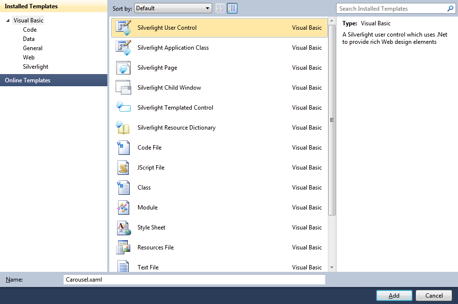
Select Project then "Add New Item...", and select the "Silverlight User Control" Template if not already Selected, then change the "Name" to Carousel.xaml, see below:
Step 9
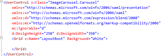
Add the new User Control to the Project by Clicking on Add, then in the XAML Pane for the Carousel.xaml User Control,
for the "<UserControl>" Tag change the DesignHeight Atrribute to "250" and DesignWidth Attribute to "350", see below:
Step 10
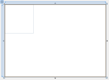
While still in the XAML Pane for Carousel.xaml below the "<Grid>" and above the "</Grid>" Tag, type the following XAML:
<Canvas Height="250" Width="350" x:Name="Container">
  <Canvas Height="100" Width="100" x:Name="Display"/>
</Canvas>
See below:
Step 11
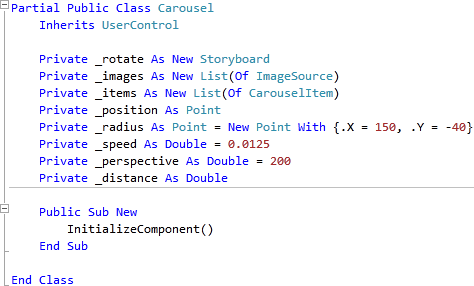
Right Click on the Page or the entry for "Carousel.xaml" in Solution Explorer and choose the "View Code" option. In the Code View below the "Inherits UserControl" line type the following:
Private _rotate As New Storyboard
Private _images As New List(Of ImageSource)
Private _items As New List(Of CarouselItem)
Private _position As Point
Private _radius As Point = New Point With {.X = 150, .Y = -40}
Private _speed As Double = 0.0125
Private _perspective As Double = 200
Private _distance As Double
See Below:
Step 12
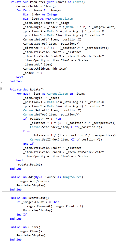
While still in the Code View for Carousel, above the "Public Sub New()" line type the following Subs:
Private Sub Populate(ByRef Canvas As Canvas)
  Canvas.Children.Clear()
  For Each _image In _images
    Dim _index As Integer
    Dim _item As New CarouselItem
    _item.Image.Source = _image
    _item.Angle = _index * ((Math.PI * 2) / _images.Count)
    _position.X = Math.Cos(_item.Angle) * _radius.X
    _position.Y = Math.Sin(_item.Angle) * _radius.Y
    Canvas.SetLeft(_item, _position.X)
    Canvas.SetTop(_item, _position.Y)
    _distance = 1 / (1 - (_position.Y / _perspective))
    _item.ItemScale.ScaleY = _distance
    _item.ItemScale.ScaleX = _item.ItemScale.ScaleY
    _item.Opacity = _item.ItemScale.ScaleX
    _items.Add(_item)
    Canvas.Children.Add(_item)
    _index += 1
  Next
End Sub

Private Sub Rotate()
  For Each _item As CarouselItem In _items
    _item.Angle -= _speed
    _position.X = Math.Cos(_item.Angle) * _radius.X
    _position.Y = Math.Sin(_item.Angle) * _radius.Y
    Canvas.SetLeft(_item, _position.X)
    Canvas.SetTop(_item, _position.Y)
    If _radius.Y >= 0 Then
      _distance = 1 * (1 - (_position.Y / _perspective))
      Canvas.SetZIndex(_item, CInt(_position.Y))
    Else
      _distance = 1 / (1 - (_position.Y / _perspective))
      Canvas.SetZIndex(_item, CInt(_position.Y))
    End If
    _item.ItemScale.ScaleY = _distance
    _item.ItemScale.ScaleX = _item.ItemScale.ScaleY
    _item.Opacity = _item.ItemScale.ScaleX
  Next
  _rotate.Begin()
End Sub

Public Sub Add(ByVal Source As ImageSource)
  _images.Add(Source)
  Populate(Display)
End Sub

Public Sub RemoveLast()
  If _images.Count > 0 Then
    _images.RemoveAt(_images.Count - 1)
    Populate(Display)
  End If
End Sub

Public Sub Clear()
  _images.Clear()
  Populate(Display)
End Sub
See Below:
Step 13
Still In the Code View for the Carousel User Control in the "Public Sub New()" Constructor below the "InitializeComponent()" line type the following:
Canvas.SetLeft(Display, Container.Width / 2 - Display.Width / 2)
Canvas.SetTop(Display, Container.Height / 2 - Display.Height / 2)
AddHandler _rotate.Completed, AddressOf Rotate
_rotate.Begin()
See Below:

Step 14
Select Debug then the "Build ImageCarousel" option from the menu, see below:
Step 15
Return to the MainPage.xaml Designer View by selecting the "MainPage.xaml" Tab, or Double Clicking on the Entry for "MainPage.xaml"
in Solution Explorer.
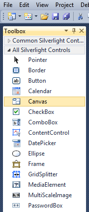
Then from the All Silverlight Controls section in the Toolbox select the Canvas control:
Step 16
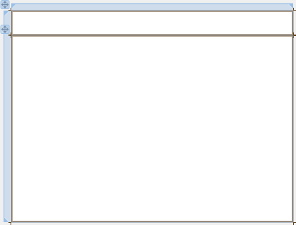
Draw a Two Canvases on the Page then in the XAML Pane above the "</Grid>" then change the "<Canvas>" lines to the following:
<Canvas Height="35" Width="400" VerticalAlignment="Top" HorizontalAlignment="Left" Name="Toolbar"></Canvas>
<Canvas Height="265" Width="400" Margin="0,35,0,0" VerticalAlignment="Top" HorizontalAlignment="Left" Name="Body"></Canvas>
See below:
Step 17
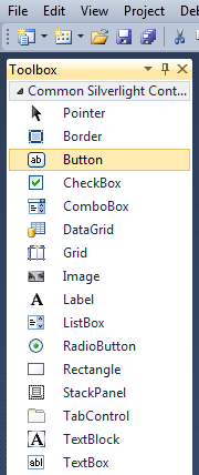
Then from the Common Silverlight Controls section in the Toolbox select the Button control:
Step 18
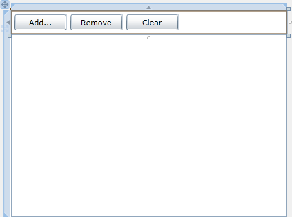
Draw Three Buttons on the "Toolbar" Canvas by dragging the Buttons from the Toolbox onto the Canvas then in the XAML Pane inbetween the "<Canvas>" and "</Canvas>" tags change the "<Button>" lines to the following:
<Button Canvas.Left="6" Canvas.Top="6" Height="23" Width="75" Name="Add" Content="Add..."/>
<Button Canvas.Left="87" Canvas.Top="6" Height="23" Width="75" Name="Remove" Content="Remove"/>
<Button Canvas.Left="168" Canvas.Top="6" Height="23" Width="75" Name="Clear" Content="Clear"/>
See below:
Step 19
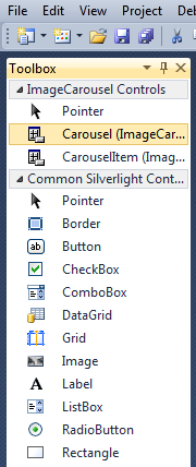
Then from the ImageCarousel Controls section in the Toolbox select the Carousel control:
Step 20
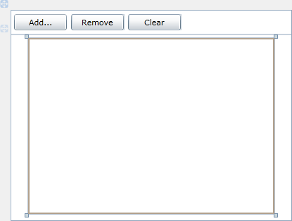
Draw a Carousel on the larger Canvas (Body) by dragging the Carousel from the Toolbox onto the Canvas, then in the XAML Pane inbetween the "<Canvas>" and "</Canvas>" tags change the "my:Carousel" XAML to the following:
<my:Carousel Canvas.Left="25" Canvas.Top="5" x:Name="Images"/>
See below:
Step 21
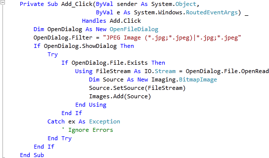
While Still in the Designer View for MainPage.xaml, Double Click on the "Add..." Button and type in the Add_Click Sub:
Dim OpenDialog As New OpenFileDialog
OpenDialog.Filter = "JPEG Image (*.jpg;*.jpeg)|*.jpg;*.jpeg"
If OpenDialog.ShowDialog Then
  Try
    If OpenDialog.File.Exists Then
      Using FileStream As IO.Stream = OpenDialog.File.OpenRead
        Dim Source As New Imaging.BitmapImage
        Source.SetSource(FileStream)
        Images.Add(Source)
      End Using
    End If
  Catch ex As Exception
    ' Ignore Errors
  End Try
End If
See Below:
Step 22
Return to the Designer View by selecting the "MainPage.xaml" Tab, or Right Click on the Page or the Entry for "MainPage.xaml" in Solution Explorer and choose the "View Designer" option.
Double Click on the "Remove" Button and type in the Remove_Click Sub:
Images.RemoveLast()
See Below:

Step 23
Return to the Designer View by selecting the "MainPage.xaml" Tab, or Right Click on the Page or the Entry for "MainPage.xaml" in Solution Explorer and choose the "View Designer" option.
Double Click on the "Clear" Button Control and type in the Clear_Click Sub:
Images.Clear()
See Below:

Step 24
Save the Project as you have now finished the Silverlight application. Select Debug then Start Debugging or click on Start Debugging:
After you do, the following will appear in a new Web Browser window:

Step 25
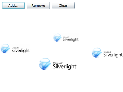
Click on the Add Button, then using the File Open Dialog select an Image, you can do this multiple times to add more Images to the Carousel, see below:
Step 26
Close the Application and Browser window by clicking on the Close Button ![]() on
the top right of the Application Window and Web Browser to Stop the application.
on
the top right of the Application Window and Web Browser to Stop the application.
This is a simple Carousel-based way of displaying images, it could be altered so it displays anything in a carousel including Videos or any Content, try changing it such as making it a vertical carousel - make it your own!


